
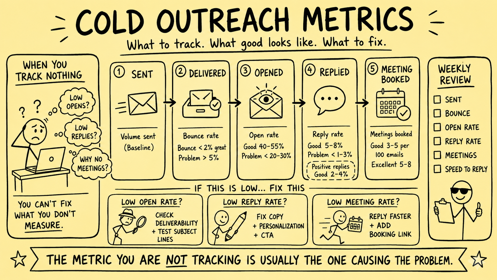
An outreach dashboard can look precise while answering the wrong question. A high open rate may reflect privacy-related preloading. A delivered message may have reached a spam folder. A reply may be an objection. A booked meeting may be unqualified. A pipeline value may be a guess multiplied by another guess.
This article previously labeled fixed bounce, open, reply, positive-reply, meeting, and touch-level percentages as excellent, good, acceptable, or problematic. It also prescribed universal sending times and response deadlines, assigned single causes from weak signals, recommended specific vendors, estimated pipeline from assumed close rates, and claimed cold outreach typically had the lowest acquisition cost. Those unsupported benchmarks, causal claims, vendor prescriptions, and outcome promises were removed.
Direct answer: Measure seller and buyer outreach as a chain of defined events. For every metric, publish the numerator, denominator, eligible population, relationship type, channel, observation window, exclusions, source, and known measurement limits. Use provider thresholds only for the traffic they govern, local baselines for operational diagnosis, and verified downstream evidence for business outcomes.
This is operating guidance, not legal or transaction advice. Marketing, privacy, calling, professional, licensing, and recordkeeping requirements vary by jurisdiction, channel, recipient, subscriber type, relationship, purpose, and data. Qualified owners should approve the policy before outreach begins.
Start with the business question
Different questions need different measures.
| Question | Evidence that helps | What it does not prove |
|---|---|---|
| Can this record be contacted for this purpose? | Provenance, jurisdiction, relationship, channel eligibility, preference and suppression checks | That contact will be useful or welcome |
| Did the infrastructure accept the message? | Provider event, authentication result, delivery response | Inbox placement or human attention |
| Did the person respond? | Verified inbound event linked to the outbound message | Interest, fit, authority, or readiness |
| Did a qualified next step occur? | Reviewed criteria, owner decision, accepted action | An engagement, revenue, or transaction |
| Did the relationship progress? | Verified stage transition with dated evidence | That outreach alone caused the change |
| Did the work create economic value? | Realized revenue, attributable cost, defined attribution method | Incremental value without a credible comparison |
Do not choose a metric because the sending platform displays it. Choose it because it supports a defined operating decision.
Separate seller, buyer, referral, and deal contexts
“Cold outreach” can hide unlike activities:
- Seller sourcing to a business owner
- Buyer development or criteria confirmation
- Dormant relationship reactivation
- Referral-source communication
- Follow-up on an agreed service step
- Communication within a live transaction
Report these separately. A seller who explicitly declines, a buyer whose criteria do not match, a referral without permission, and a live deal awaiting a document are not one funnel.
Live-deal communications belong in the matter workflow, with the appropriate owner, authority, confidentiality, and deadlines. They should not be counted as marketing outreach merely because the same email system sent them.
Define the eligible denominator first
Rates become misleading when the denominator changes silently.
For an outreach cohort, record:
- Relationship and intended purpose
- Inclusion and exclusion rules
- Original data source and collection date
- Jurisdiction and relevant subscriber or entity type
- Identity resolution and duplicate handling
- Channel eligibility and approved basis where required
- Objections, withdrawals, opt-outs, suppression, and preference services
- Retention and data-quality status
- Campaign, message, sender, domain, and policy versions
- Cohort start, cutoff, time zone, and follow-up horizon
An “eligible record” should mean the contact passed the approved checks at the time of the proposed action. Keep excluded counts and reason codes visible. Removing suppressed, duplicate, invalid, or out-of-scope records from the denominator without reporting them can make a rate look better while hiding a control problem.
The ICO’s current B2B marketing guidance distinguishes channels and subscriber types in the UK context and addresses personal data, preference services, transparency, objections, and suppression. B2B is not a universal exemption.
The FTC CAN-SPAM business guide explains U.S. requirements for commercial email, including accurate identity, non-deceptive subject lines, postal information, opt-out mechanisms and handling, message purpose, and vendor responsibility. Provider compliance and legal compliance are related but not interchangeable.
Build an event dictionary
Define each event before calculating a rate.
| Event | Minimum definition |
|---|---|
| Proposed | An identified workflow requested an action for a specific record and purpose |
| Eligible | Approved checks passed immediately before queueing |
| Queued | One unique action entered the provider queue |
| Provider accepted | The provider accepted the message for processing |
| Delivered | The sending system recorded no terminal delivery failure under its documented definition |
| Bounced | A provider returned a classified temporary or permanent failure |
| Complaint | A recipient complaint appeared through a provider-supported feedback source |
| Opt-out or objection | A preference change was received through any supported channel |
| Open signal | A tracking resource loaded; not proof of reading |
| Reply | A verified inbound message was linked to the outreach action |
| Qualified reply | A reviewer applied a versioned classification using available evidence |
| Accepted next step | The appropriate person agreed to a defined action |
| Completed next step | The action occurred and completion evidence was recorded |
| Stage transition | An authorized owner approved a new relationship state |
Preserve the event ID, occurred-at and recorded-at time, source, actor, record and relationship IDs, message or call purpose, previous and proposed states, and correction history. Make processing idempotent so retries do not inflate send, reply, task, meeting, or pipeline counts.
Use a metric contract
Every dashboard measure should have a short contract:
- Business question
- Numerator
- Denominator
- Unit of analysis
- Eligible population
- Event definitions
- Time and attribution window
- Exclusions and missing-data treatment
- Source systems and owner
- Refresh latency
- Known limitations
- Decision or escalation supported
For example, “reply rate” is incomplete. Is the denominator proposed records, eligible records, unique people, attempted messages, provider-accepted messages, or delivered messages? Does the numerator count automatic replies, bounces, objections, duplicate replies, replies after the cutoff, or replies to another message in the sequence?
Publish the raw counts next to every rate. A 50% rate based on two eligible records is not operationally equivalent to the same rate based on two thousand.
Treat sender requirements as scoped thresholds
Some thresholds come from mailbox providers. They are not business-performance benchmarks.
Google’s current email sender guidelines describe requirements for mail sent to personal Gmail accounts, including authentication, DNS, TLS, message formatting, spam-rate monitoring, and added requirements for senders above its stated daily-volume boundary. Google advises keeping its Postmaster Tools spam rate below 0.1% and avoiding 0.3% or higher, but that measurement has a defined Gmail population and provider methodology.
Yahoo’s current Sender Best Practices require authentication and low complaint rates for all senders, with additional DMARC and easy-unsubscribe requirements for bulk senders. Yahoo describes a complaint-rate boundary for its own environment and explains that its calculation is based on mail delivered to the inbox.
Do not merge provider-specific rates into one unlabeled “spam complaint rate.” Record provider, covered traffic, numerator, denominator, time period, reporting delay, and unavailable data. A low reported rate can coexist with filtered mail, small samples, missing feedback, or traffic outside the dashboard.
Monitor at least:
- SPF, DKIM, and DMARC results and alignment where applicable
- TLS and message-format errors
- Provider acceptance, temporary failure, permanent failure, and retry state
- Domain and IP reputation indicators available to the sender
- Provider-specific complaint measurements
- One-click and visible unsubscribe behavior where required
- Suppression propagation and pending-message cancellation
- Unexpected sending volume, source, or identity
Treat provider requirements as a floor for the traffic they cover, not permission to send unwanted or ineligible mail.
Do not diagnose from opens
An open event usually means a remote tracking resource loaded. It does not prove that the intended person saw, read, understood, or acted on the message.
Google’s sender guidance states that Google does not track open rates and cannot verify the accuracy of open rates reported by third parties. Apple’s Mail Privacy Protection documentation explains that remote content can be privately downloaded in the background when a message is received rather than when it is viewed.
Other clients, privacy tools, security scanners, image blocking, forwarding, and caching can further alter the signal. Therefore:
- Do not classify a person as engaged because a pixel loaded
- Do not trigger sensitive personalization or repeated outreach from an open alone
- Do not diagnose subject-line quality solely from open rate
- Do not compare open rates across cohorts with different client mixes as if they were equivalent
- Do not use opens as evidence of consent, receipt of a disclosure, or completion of a professional step
If retained, label it “open signal,” document the tracking method, and use it only as a weak system diagnostic.
Measure delivery without pretending it is inbox placement
Useful delivery measures include:
- Proposed, eligible, queued, and provider-accepted counts
- Unique recipients and unique actions
- Temporary and permanent failures by response code
- Retry attempts and final state
- Authentication and alignment failures
- Provider-specific delivery errors
- Suppression blocks and late cancellations
- Duplicate-send and wrong-recipient incidents
Calculate failure rates using a defined event and denominator. Separate permanent failures from temporary ones. Preserve response codes rather than reducing every problem to “bounce.”
A provider acceptance or absence of a bounce does not prove inbox placement. Do not assign a fixed causal diagnosis such as “bad list” or “damaged domain” from one aggregate percentage. Investigate identity quality, address age, acquisition source, authentication, content, infrastructure, provider feedback, volume changes, and cohort differences.
Classify replies by evidence and action
“Positive reply” is too vague to govern a brokerage workflow.
Use reviewed classes such as:
- Explicit objection, opt-out, or channel preference
- Wrong person, wrong role, or identity correction
- Automatic or out-of-office response
- Referral or redirect, subject to permission review
- Seller interest requiring owner verification
- Buyer interest requiring criteria and qualification review
- Request for information within an approved disclosure boundary
- Request to revisit at a stated date or event
- Complaint, privacy request, dispute, or security concern
- No current fit under documented criteria
- Unclear response requiring human review
Store the source reply, classifier, classification time, evidence, confidence, policy version, owner, and resulting action. AI can propose a label, but objections, confidential matters, qualification, seller intent, buyer access, valuation language, and deal-state changes need accountable review.
Measure reply counts and rates by class. A rising total reply rate can be harmful if the increase comes from objections, corrections, or complaints.
Replace “meetings booked” with a transition chain
A calendar event is an intermediate operational state.
Track:
- Meeting proposed
- Meeting accepted by an authorized participant
- Qualification evidence available at booking
- Scheduled, rescheduled, canceled, or no-show state
- Meeting completed
- Agreed next step and owner
- Next step completed
- Relationship stage reviewed and approved
Do not automatically create a qualified deal because a booking link was used. Do not assume that a direct booking link always reduces friction; some broker relationships require identity, confidentiality, ownership, or fit checks before scheduling.
Report seller and buyer paths separately. Define what “qualified” means, what evidence supports it, who approved it, and which facts remain self-reported.
Keep pipeline, revenue, and attribution honest
Potential value is not realized revenue. A meeting count multiplied by an average deal value and an assumed close rate can create a precise-looking number without transaction-level evidence.
Maintain separate fields for:
- Unweighted potential value and its source
- Probability or stage weight, method, version, and validation period
- Expected fees under documented assumptions
- Signed engagement or mandate evidence
- Transaction milestone evidence
- Realized and collected revenue
- Direct and allocated outreach costs
- Refunds, write-offs, and later corrections
If weighted pipeline is used, validate the weights against sufficiently representative historical cohorts and recalculate them when the process or market changes. Never present weighted pipeline as booked revenue.
Attribution also needs rules. Decide how to handle prior relationships, referrals, multiple channels, inbound activity after outreach, shared ownership, long time lags, and several touches. “Originated from outreach” is not the same as “caused by outreach.”
Do not claim outreach has the lowest acquisition cost without a comparable, complete cost model. Include data, tools, staff time, research, review, training, compliance, management, vendor, remediation, and opportunity costs under a consistent method.
Compare cohorts, not dashboard totals
Useful cohort dimensions include:
- Seller, buyer, referral, or dormant relationship
- New, known, active, paused, or live-deal context
- Source and data age
- Geography and jurisdiction
- Subscriber or entity type where relevant
- Channel and provider
- Message, offer, sequence, sender, and policy version
- Relationship owner and handling team
- Business-hours and out-of-hours processing
- Eligibility, identity, and qualification completeness
Choose the dimensions before reviewing the result. Repeatedly slicing the data until a favorable pattern appears creates fragile conclusions.
Show observation windows. A recent cohort has had less time to reply, book, complete a meeting, sign an engagement, or reach a transaction outcome. Use mature cohorts for later-stage comparisons or report time-to-event distributions.
Diagnose with hypotheses, not a deterministic tree
A weak metric can have several causes. Build a hypothesis register containing:
- Observed signal
- Metric contract and affected cohort
- Candidate explanations
- Supporting and contradicting evidence
- Missing data
- Risk if the hypothesis is wrong
- Proposed test
- Owner and decision date
For low verified delivery, investigate address quality, provider response codes, authentication, reputation, formatting, volume, and infrastructure. For fewer qualified replies, investigate audience fit, identity, offer, claims, message clarity, disclosure boundaries, timing, channel, and classification consistency. For accepted meetings that do not progress, inspect qualification, owner handoff, attendance, service quality, process friction, and external timing.
Do not infer that copy is the cause merely because opens appear high and replies appear low. Both measures can be distorted, and other variables may differ.
Run controlled operational tests
Predefine:
- One hypothesis and one principal change
- Eligible population and exclusions
- Assignment method
- Baseline and comparison cohort
- Primary transition measure
- Guardrails for complaints, objections, confidentiality, and workload
- Minimum observation window
- Stop and rollback conditions
- Analysis method and decision owner
Change one material variable where practical. Preserve the message and policy versions actually used. Include failed, blocked, and missing records in the report.
An observed change after an intervention is not automatically causal. Audience shifts, seasonality, owner capacity, provider filtering, list source, market events, and other concurrent changes may explain it.
Match review frequency to risk and volume
There is no universal weekly or monthly cadence.
Review immediately when authentication fails, an unauthorized sender appears, suppression conflicts occur, complaint or bounce behavior changes sharply, unexpected volume is detected, confidential information may have been disclosed, or provider enforcement appears.
Operational queues may need daily ownership at meaningful volume. Low-volume reply, qualification, engagement, and revenue measures may need longer windows so late outcomes can mature. Record provider reporting latency and do not treat incomplete recent data as final.
A broker outreach scorecard
Use one page with counts, rates, and exceptions across five layers.
Eligibility and control
- Proposed, eligible, blocked, and canceled actions
- Exclusion reasons and missing evidence
- Suppression checks and propagation failures
- Identity and duplicate exceptions
- Approvals, corrections, and rejections
Infrastructure and delivery
- Authentication and alignment results
- Provider acceptance and classified failures
- Retry and duplicate behavior
- Provider-specific complaints and feedback availability
- Unsubscribe and cancellation processing
Response and service
- Replies by reviewed class
- Unassigned and aging replies
- Brokerage commitments accepted, completed, and overdue
- Complaints, privacy requests, and incidents
Qualification and progression
- Seller and buyer qualification decisions by evidence state
- Accepted and completed next steps
- Meetings proposed, held, missed, or canceled
- Authorized stage transitions and reversals
Economic evidence
- Signed engagements attributed under a stated rule
- Realized and collected revenue
- Complete channel cost under a consistent method
- Cohort maturity and attribution uncertainty
The practical conclusion
“What good looks like” is not a universal open, reply, or meeting percentage. Good measurement means the team can explain who was eligible, what happened, how it was counted, which provider rule applied, what the person actually communicated, which next step was verified, what remains unknown, and which risk or decision the metric supports.
Use provider thresholds for their stated provider context. Treat opens as weak signals. Separate reply volume from reply quality. Keep meetings, pipeline, realized revenue, and causality distinct. Compare like cohorts and improve one controlled variable at a time.
To build the surrounding system, review broker growth operations and operations streamlining, or request a Business Broker Pipeline & Operations Assessment.
Frequently Asked Questions
What is a good cold-email reply rate for a business broker?
There is no defensible universal rate. A useful comparison requires the same eligible audience, seller or buyer relationship, channel, offer, sequence, period, reply definition, observation window, exclusions, and data quality. Establish a local baseline and inspect reply quality and downstream progression.
Should brokers track email open rates?
Treat opens as a weak, provider-dependent diagnostic only. Tracking pixels can be blocked or preloaded, Google says it cannot verify third-party open-rate accuracy, and Apple Mail Privacy Protection can download remote content in the background. Do not use an open event as proof that a person read or understood a message.
Which outreach metrics should a brokerage prioritize?
Prioritize eligibility and suppression accuracy, authenticated delivery, verified replies by type, accepted qualified next steps, completed brokerage commitments, downstream stage evidence, complaints, confidentiality exceptions, and reconciliation failures. Always retain counts alongside rates.
Is a meeting booked a successful outreach outcome?
It is an intermediate event, not proof of fit, engagement, revenue, or a transaction. Record who booked it, qualification evidence available at that time, attendance, accepted next step, and later progression without automatically creating or advancing a deal.
How often should outreach metrics be reviewed?
Set review frequency from sending volume, risk, provider feedback latency, staffing, campaign duration, and incident severity. Authentication failures, suppression conflicts, complaints, or unexpected volume may require immediate action; low-volume outcome reviews may require a longer observation window.
Sources and evidence notes
Primary or first-party materials reviewed for this article. Scope and limitations are stated rather than silently generalized.
- Email sender guidelinesGoogle · Accessed
Current requirements and recommendations for email sent to personal Gmail accounts, including authentication, DNS, TLS, message formatting, spam-rate monitoring, and additional duties for high-volume senders. Google also states that it does not track open rates and cannot verify third-party open-rate accuracy.
- Sender Best PracticesYahoo Sender Hub · Accessed
Current Yahoo sender requirements covering authentication, DNS, complaint-rate monitoring, RFC conformance, and additional unsubscribe and DMARC requirements for bulk senders. These are provider requirements, not reply or transaction benchmarks.
- Protect email privacy in Mail on MacApple Support · Accessed
Current Apple documentation explaining that Mail Privacy Protection privately downloads remote content in the background, limiting what senders can infer from tracking pixels and apparent opens.
- Business-to-business marketingUK Information Commissioner’s Office · Accessed
Current UK guidance on B2B marketing across electronic mail, live calls, automated calls, personal data, subscriber types, preference services, transparency, objections, and suppression.
- CAN-SPAM Act: A Compliance Guide for BusinessU.S. Federal Trade Commission · Accessed
Official U.S. guidance on commercial-email identity, subject lines, advertising identification, postal address, opt-out mechanisms and timing, message purpose, and responsibility for vendors.
Brokerage data stays governed. Material deal decisions stay human.
We design business broker systems around least-privilege access, documented data flows, protected credentials, traceable activity, and approval gates. Systemify does not use client information to train its own models. When a workflow uses an external AI provider, its purpose, data fields, and retention approach are documented and approved before client data is transferred.
Apply this to your brokerage
We can assess your buyer and seller pipeline, valuation and vetting workflows, communications, documents, controls, and handoffs before recommending what to build.
Talk to a Broker Systems Expert